Client Question: Yield Curve
March 2, 2023
Interest rates have never been such a hot topic of conversation! It seems you can’t turn on the news or talk to your friends lately without someone bringing up interest rates (did you see what you can earn on cash? look at how much mortgage rates have gone up! should I just buy the 2-year treasury?)

All this talk about interest rates has captured clients’ attention too (fair enough!) and in a recent meeting, a client asked about the yield curve and how to use it as a tool. Let’s dive in.
What is a yield curve?
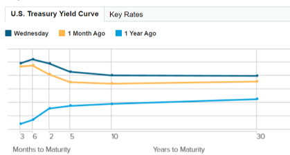
A yield curve is a graphical illustration of interest rates over varying maturities. The x axis is time/maturities and the y axis is rates.
It can be used as a reference guide for all types of fixed income securities. However, a commonly viewed/used yield curve is that of US treasuries, showing the rate the US government will pay you on funds you lend to the government over various time periods ranging from three-months to 30 years.
Here is that yield curve as of the prior closing date before this post (March 1, 2023), -spoiler alert, this is a very “odd” shaped yield curve, more on that below! (You can see a more “normal” curve by looking at the one from a year ago (the light blue line)).
What’s the purpose of a yield curve?
Investors can use a yield curve to easily visualize the different returns (ie: interest rate) you can get at various time periods. This comparison can help investors determine if committing funds for a longer timeframe is “worth” the interest rate differential – or to determine how long they need to commit capital for to reach a given return in fixed income.
However, the yield curve is also used more broadly as a barometer of economic health and a sign of what’s to come – based on the shape and slope of the curve. In general, there are three shapes: upward-sloping (also called positive), downward-sloping (also called inverted), and flat.
Before we dive into how a curve would come to be one of these shapes, keep in mind what drives interest rates along the yield curve. On the short-end, rates are heavily driven by actions of the Federal Reserve (as they move Fed Funds rate up and down to control monetary policy). However, longer term rates are driven by expectations of economic growth.
- A positive, upward-sloping yield curve occurs when yields of shorter maturities are lower than yields of longer maturities. This is considered “normal” and a sign of a healthy economy. Longer-term rates being higher than shorter-term rates implies future economic growth that would lead to higher inflation and higher rates of return over the long term
- An inverted, downward-sloping yield curve forms when yields of shorter maturities are higher than longer maturities (ie: the curve is the inverse of what you’d expect). How does this happen? Investors expect economic growth to slow in the future (which would result in lower levels of interest rates than are available today). This fear of rates being lower in the future drives up current demand for these maturities, which in turn lowers the current yields on those tranches. If short term rates remain elevated (due to fed action for instance), the curve inverts. Historically, inverted yield curves have been leading indicators of recessions.
- A flat yield curve results when yields for short- and long-term maturities are roughly equal. Typically this occurs in transition from upward to downward or vice versa and doesn’t hold for long.
What kind of curve do we have today?
We presently have an inverted yield curve, with rates available on shorter maturities higher than those available on longer maturities (see above picture). Short-term rates have increased drastically as the Federal Reserve has taken up fed funds rates in an attempt to slow spending and inflation. At the same time, rates on the long end of the curve are being driven down by fears of slowing growth in the future. Long term rates < short term rates = inversion.
How can I use a yield curve?
The yield curve is just one source of information you can consider as you build a balanced portfolio that includes fixed income securities. It can help you evaluate your options in fixed income and assess the available returns across various time periods. You can also use it as a barometer of where things stand in markets more broadly but keep in mind – there’s usually more to the story than one graph can tell!
Leave a Reply
You must be logged in to post a comment.
Leave a note